- Good UX exemples
- Design Principles
- User Experience Patterns, Best Practices
- Navigation
- Breadcrumbs
- Language selection
- Search engine
- Search box
- Search Results
- Forms
- Fields
- Buttons
- Login forms
- Mobile forms
- Data tables
- eCommerce related patterns
- Paiement check out
- Coupons
- Notifications system
- Email notification
- Empty states
- Skeleton state
- Error management and recovery
- 404 error pages
- Colour use
- Design systems
- Atomic design
- Everything is a component
- Pattern library
Good UX exemples

Design Principles
User Experience Patterns, Best Practices


Navigation

Breadcrumbs

Language selection

Search engine


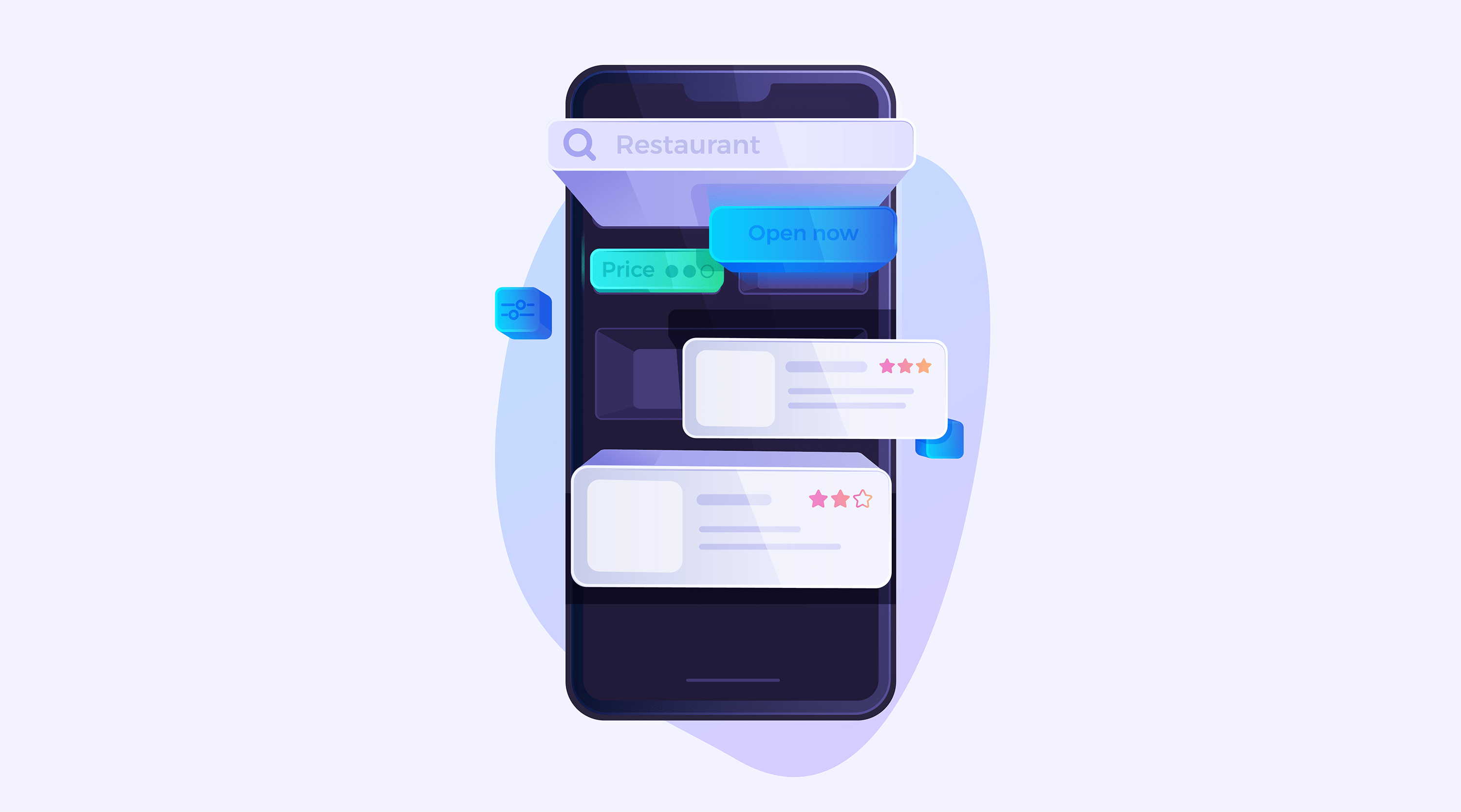
Search box
2009

Search Results
Exercices - 01 | Le bloc-notes, UX & Design d'expérience utilisateur
Forms

Fields
Buttons

Login forms
Mobile forms


Data tables


eCommerce related patterns
Paiement check out

Coupons


Notifications system
Notifications are anti UX. They are a distraction. So how to design your notification so that it becomes purposeful and useful?


Email notification


Empty states
aka null state
Skeleton state


Error management and recovery
404 error pages

Colour use
![[TUXT #4] La (véritable !) psychologie des couleurs.](https://images.spr.so/cdn-cgi/imagedelivery/j42No7y-dcokJuNgXeA0ig/9a67f214-35d6-444f-a333-04973e8ef264/0-gjg29pai1p0q5e2l/w=1920,quality=90,fit=scale-down)
Design systems
Atomic design
Created by Brad Frost first method to integrate the component approach, has been since then overshadowed by a more widespread approach "everything is a component"

